I thought I’d talk a little here about how I work in 3D, to get the look and feel of my renders. Part of it is about the surfacing and the lighting, working in a PBRT model (as much as LW can do this accurately) but part of it is about working in a realistic way to capture a realistic physical simulation and then using that to help me to create really realistic images in post. Good quality in equals good quality out. I’m writing this to be as non application specific as possible, to help others adapt it to their work-flows. I use LightWave and AfterFX to do this, but some of this workflow can be replicated in other software. Click on each image to see it in High resolution.
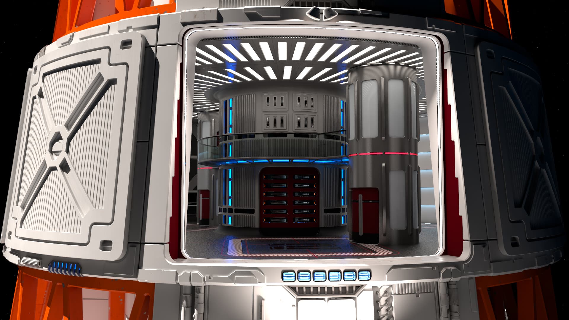
Raw Render
Ok so this is the raw render, and there’s a few things to note here: The render is really over exposed in places, and this causes clipping issues, when viewed with low-dynamic range. The lighting on the lower section blows out to pure white and the lighting strips render as an unattractive cyan colour (instead of a slightly green blue, as it appears in the reflections etc.) . This is one of the reasons I tone map the image, to re-represent these pixels and colours more accurately, but I also still use that data in the post process, as I will explain below. These images are just as they appear in the sRGB preview of AfterFX, which just shows pixels between 0<>1, but in reality many of the pixels are extremely bright, way over 1, but display technology can’t show these so they simply get clamped at 1. Tone mapping is re-mapping those pixels so that values way over 1 can be seen much more realistically, with respects to how we see things.
Ok so things to note when I set up the render:
- I made it look good in a roughly normalised view, so I made luminous surfaces very bright (600-2000% bright in some cases) to give a strong contribution to the scene lighting.
- I used Radiosity, so that luminous surfaces contribute to radiosity and reflections in a realistic way.
- If I used lights, I used PBRT lights (inverse squared falloff, and all have a volume, so they cast soft shadows). You can adjust the global intensity to bring out dark areas, but you will get the same issues you would get in a real camera: Bright areas get overexposed. You could also isolate lights into passes, but it can be very time-taking, depending on your software package (and very slow to render!). I also have a geometry/texture component twinned with the light. LightWave doesn’t currently support Light emitting geometry, but in the case of tiny lights which are extremely bright (the Spotlights in my scene) they are often served better with Lights instead, depending on how your software copes with these things (very small very bright emissive surfaces cause the dreaded fireflies!)
- I don’t use a clamped dynamic range, as this would mean I lose access to the very bright pixels I need later. This might cause issues in your renderer, but you just have to live with it.
- I save out the image as EXR, half float, as this is both sufficient for this purpose, and has the best colour/intensity preservation. By definition the image is also saved as Linear (though of course you can override it, which you shouldn’t!) Which means it works correctly all the way through the process.
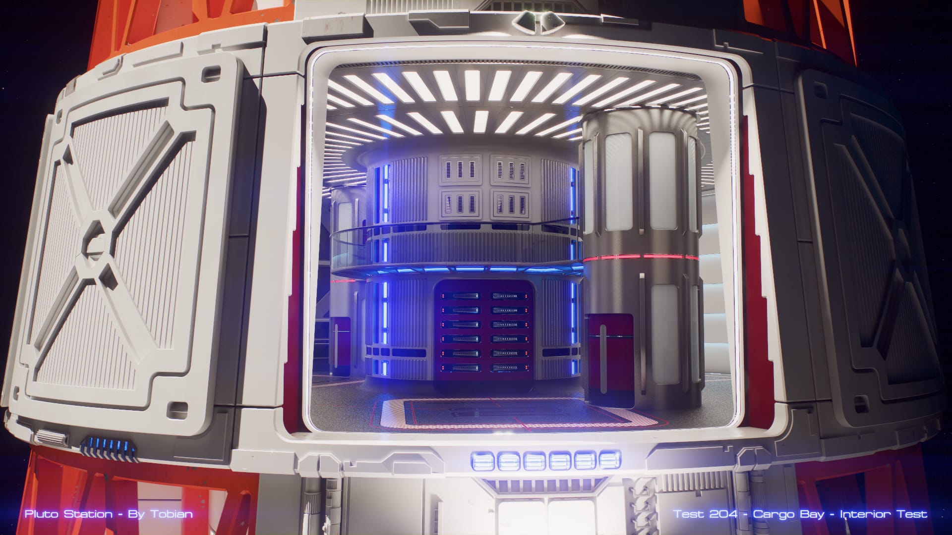
Pre-composition
Ok next step in my workflow, this is the pre-composition of the image, ready for the workflow. In AE I have a comp set up ready for this, which I just drag the image into. The pre-comp stage I do a number of things.
- Adjust the exposure of the image, which you may want to do if it’s under or over exposed, to get it to the level if you want.
- Add some irradiance falloff, it’s very subtle, but it adds to realism: Lenses are brighter in the middle, and darker towards the outside. I have chosen to do this in post, so I have more artistic control over it.
- Add any overlays at this point, I make them HDR exposure, so they bloom and glow like bright lights. (personal choice of course)
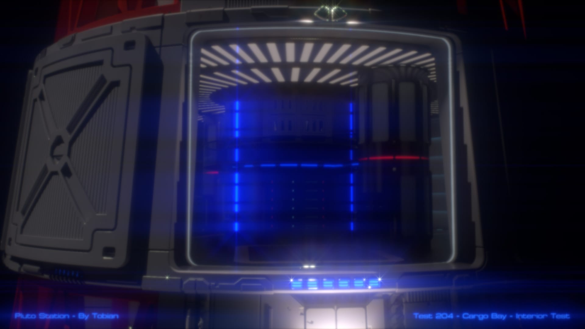
At this point I will show you an underexposed version of the image. This is how it looks as only a 5% opacity. You’ll notice a few things. You can see a few details that you could not in overexposed areas. You will notice that the very bright lighting strips now look ‘blue’ and not ‘cyan’ this is because the pixels go way over 100% in the green and blue colour channels, but very little in the red channel. There is a lot more blue than green, but since both go to over 100% it caps/clips as a cyan colour. It’s only by under exposing it, or correctly tone-mapping the image you can see the true colours.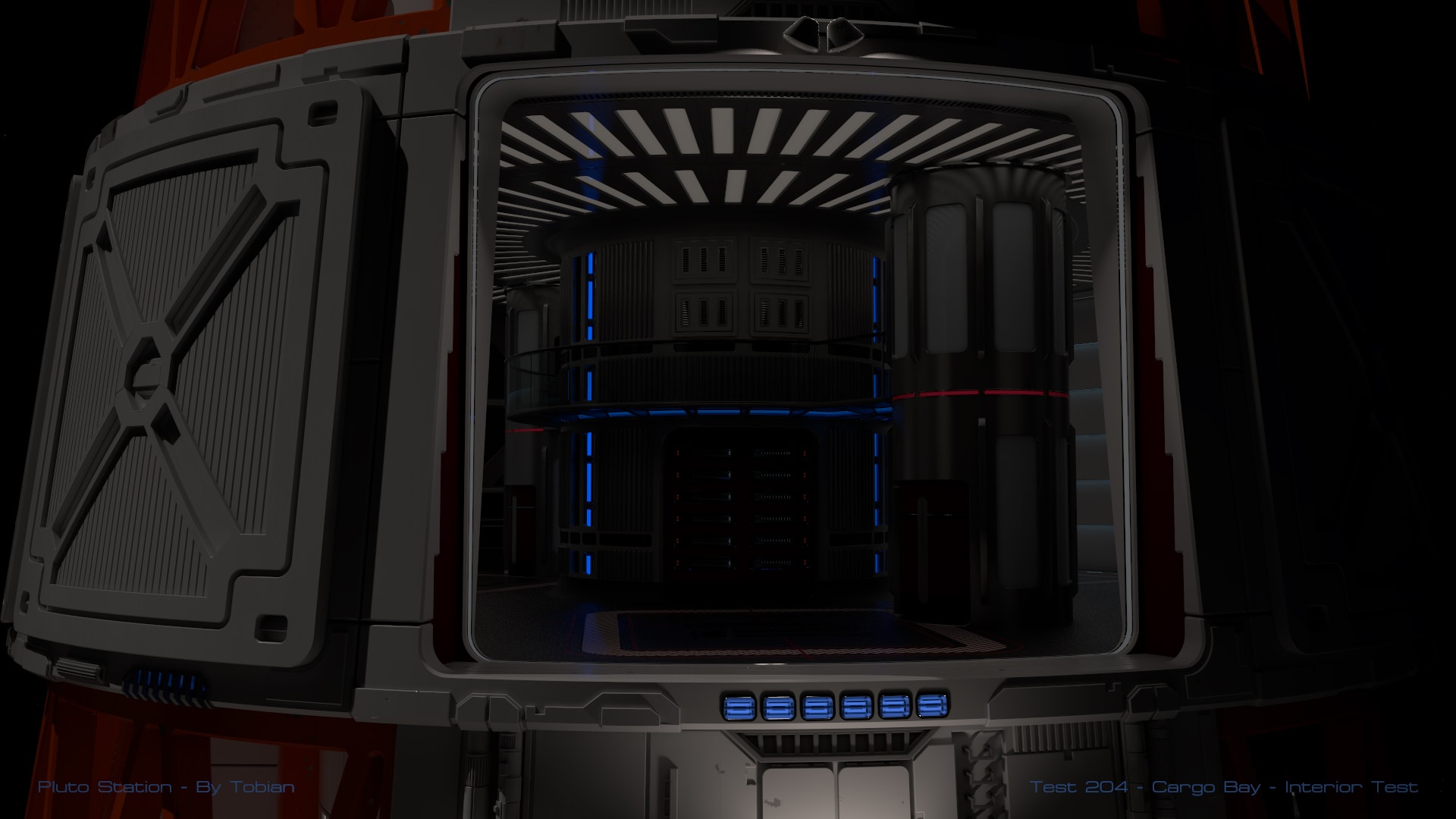
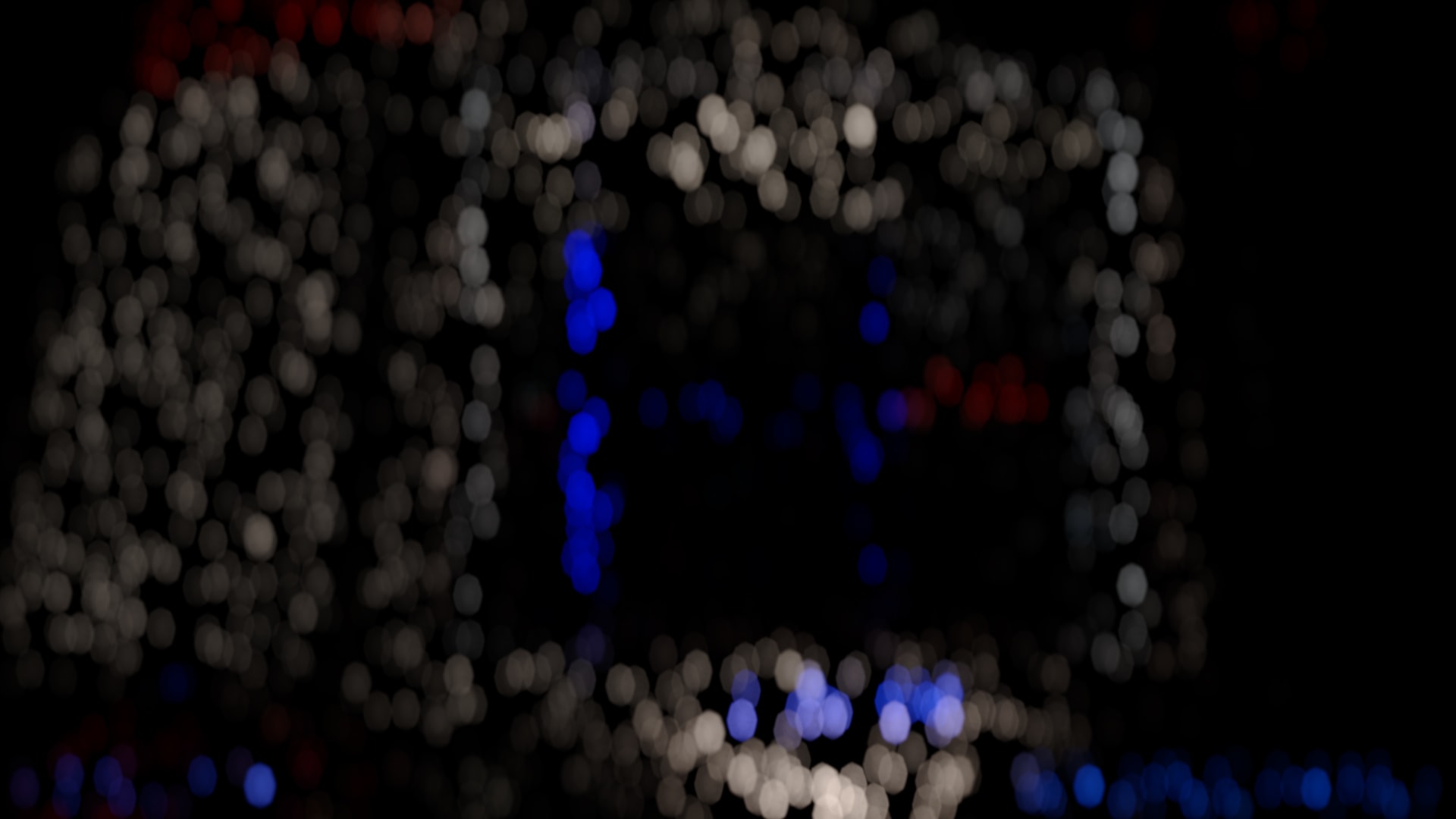
To Contrast this, I’ll show the image if I was not using float data. You lose the colour of the very bright pixels, and they look like dim cyan, not bright blue, and the areas which were over exposed are clipped in a rather unattractive way, and you lose all of that hidden detail: In this case some texture detail in the lower middle part of the screen, which was overexposed, and reflections of the blue lights in the ceiling lights.

SFX
Once I have my initial composition, I can make additional sub-compositions, each of which is modified to do FX, and all are then layered together to make the final composition. Much like my approach to surfacing and lighting, I aim to try and model how real cameras function, if imperfectly, to get the most realistic results that I can. In AE I can do this process procedurally, so once you have your basic composition, you don’t need to re-invent the wheel for each image I want to process.
Aberration
The simplest effect is a basic Aberration simulation. While Lens manufacturers try to mitigate these effects as much as they can, the lenses diffract the image slightly so that you get a slight rainbow fringing effect. this can be done a number of ways, but I just separate the image into 3 different layers, R G and B and scale each one slightly differently. I only do this about 0.2% either side, as much more looks silly. If you zoom in on the image you can make out the effect.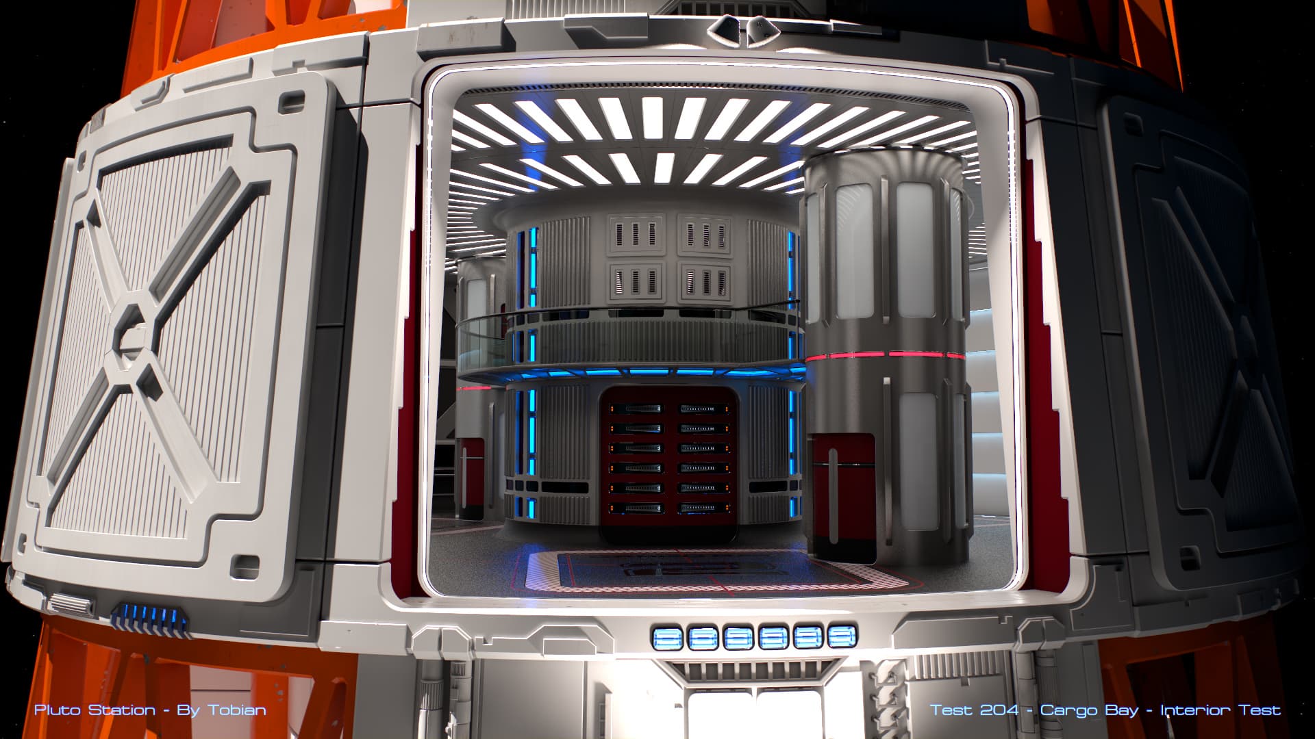
Fraunhofer Diffraction and Lens FX
This next pre-comp is what I use to recreate a Fraunhofer Diffraction and some of the lens reflections you can get. It’s not yet fully complete, as I should have more lens reflections in it, but so far it’s pleasing.
Fraunhofer diffraction is what happens due to the aperture itself (not the lens) causing a diffraction effect, which is observed to the viewer as a bloom. The shape of the aperture and the imperfectness of the lens can cause a rainbow-like diffraction effect with some very pretty patterns and spikes. The number of spikes is usually related to how many sides the aperture has. My version is mostly arrived at artistically, of course, as I haven’t got the skill to create a dedicated filter. This was actually quite complex to create, but is essentially a number of custom convolves which smears each pixel across the image according to the shape of the input image (a star and rainbow halo. Brighter pixels have a much stronger effect than very dim ones. Unlike most bloom filters, I don’t clip which pixels have an input, their inherent brightness means ones in the 0-1 brightness range have little effect, but brighter ones do.
I also do a horizontal lens reflection effect, which is tinted blue, mimicking the effect that happens with lens coatings and anamorphic lenses. Again this is just a simple convolve horizontally blurring the image and colour tinting it.
All of the filters combined make up my lensFX comp, which I layer over the final comp, but only at a very low opacity, as these effects should only be very visible for extremely bright items in frame.
Unlike many VFX software simulations, this is a whole-image convolution, and not a point tracker. Point trackers find bright spots on your image and paint a flare over the top of it. This however often results in inaccuracies, and you can only really get round point flares out of it. This solution gives you shaped flares, based on the bright pixels in the image. You can see the shape of the flares round the central luminous pixels in the central part of the screen.
Dust
The Dust layer is a basic image-based simulation of dust particles on the lens. It’s not terribly accurate, but it can look very pretty. The effect is quite simple: Create a point particle cloud which is static, and use this as a mask for the image; Then use a DOF effect on the points, using the same DOF lens you use for the image, in my case I use an 8 sided lens aperture image, which is imperfect, and slightly anamorphically distorted.
Just like the LensFX layer, this is only layered at a low opacity, as dust is rarely that visible on the lens, and microscopic. To be truly accurate you’d also need a barn-door simulation, but again this is outside of my skill level!
Final Composition
Once you have your pre-compositions all created, it’s simply a matter of layering them together. Because you are working in Linear colour-space, and the maths is done correctly, the intensity of the bloom and dust layers don’t overpower the final image itself. Ultimately this is down to the artistic eye, but once I got it right, I’ve found for the most part I don’t need to change the opacity of the layers for the whole thing to look right.
Tone-mapping and grading.
Probably the most tricky part to get right with the composition is the final tone-mapping step. I’ve rebuilt and replaced this step several times, and will probably keep doing so, so anything I could say here will probably be out of date by the time you read this. Much like the Final Comp balance the point is most images dropped into the loader composition should look correct in the final comp.
An overview of the main things I do in this comp go as follows:
- Remap all of the pixels between the 0-1 range. This means that the pixels are now inside LDR (limited dynamic range) and no longer HDR, though in the case of AE, it’s still operated on in Floating-Point space. I perform a simple Reinhard operator and don’t use the weird sharpening filters which create quite an over the top ugly effect.
- I then apply a filmic curve to the image, which adds the toe and shoulder to the image: crushing the blacks down, so they look less mucky and grey, and rolling off the very bright pixels, so that the top end still has information. For example it’s possible to see the reflecting highlights in the upper lighting panels. You will note that no pixel is actually ‘white’ if you roll a colour picker over the image, there’s no 255,255,255 pixels, and there shouldn’t be, because of the filmic curve.
- Apply any colour corrections, gamma boosts, and colour curves at this stage. I typically subtly warm the image by boosting the red chanel, but this is to taste, and will heavily depend on your scene. This also compensates for the addition of the blue tinted bloom effects.
- If you want to apply any sharpening at this stage, if needed, you can too. Sharpening is typically a LDR effect, and at this point the image is more or less LDR now.
- You can add film grain at this stage too, to improve that filmic look and which helps with any stepping issues caused by poor display technology. Keep it subtle.
- With your image now finished you can export it. I export it to a 16 bpp non-floatfing-point format, so that I can do any final tweaks in Photoshop and then save out as a JPG.
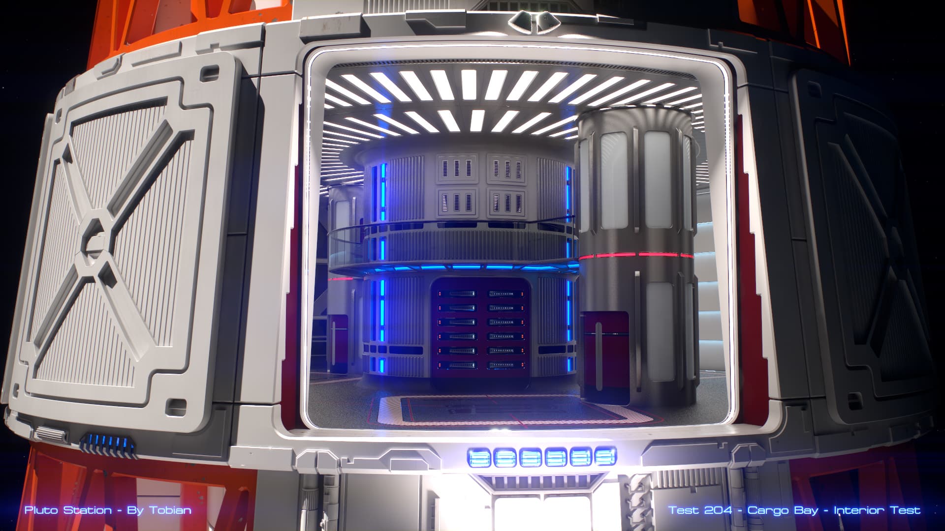
Compare the first image to the last, and you should be able to see what the differences are.
Please give me comments or questions on Twitter, or Facebook or below.